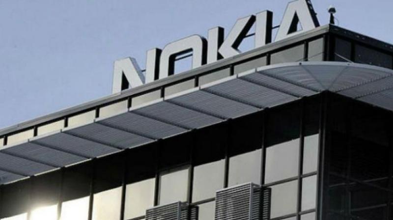
As the telecom equipment manufacturer concentrates on fast growth, Nokia has announced intentions to alter its corporate identification for the first time in nearly 60 years, complete with a new logo. The once-iconic blue hue of the former logo has been replaced with a variety of colours, depending on the application.
Nokia’s brand identity, including its logo, will be updated for the first time in nearly 60 years as part of the company’s drive for innovative growth in the telecommunications equipment industry. The redesigned logo has five alternative variations of the word NOKIA. In contrast to the former logo’s distinguishing blue colour, the new logo features a variety of hues based on its intended purpose.
According to CEO Pekka Lundmark, “there was a connection to smartphones, but we are now a corporate technology company.” He continued, “In the opinion of the majority, we are still a successful mobile phone brand, but this is not what Nokia is about. We want to develop a new brand that focuses heavily on networks and industrial digitalization, which is a completely different thing from the mobile phones of the past.”
This comment was made in advance of a business update that the company intends to release on the eve of the annual Mobile World Congress (MWC), which will be held in Barcelona from Monday, February 25, to Tuesday, March 2, 2019.
After taking over as CEO of the floundering Finnish company in 2020, Lundmark devised a three-stage strategy consisting of reset, acceleration, and expansion. Now that the reset time is ended, Lundmark is focusing on equipment sales to other businesses, despite its desire to expand its service provider company.
As a result of its development into data centres and industrial automation, Nokia will compete directly with large technology firms such as Microsoft and Amazon.
